Case Study: Yukon Government Awarded Contracts Analysis
Part 06
Report & Dashboard
Report
The main goal of data analysis is to gain and communicate relevant and actionable insights.
Data analysis isn’t just about numbers; it’s about uncovering hidden patterns and trends that can inform decision-making. Our goal is to extract relevant insights, meaningful information that directly addresses the questions we set out to answer. These insights should also be actionable, providing a clear path forward for stakeholders.
Storytelling with Data
Numbers alone can be dry and uninspiring. We need to weave data into a compelling narrative to truly captivate our audience. Imagine a detective presenting their findings – they don’t just list facts; they tell a story that connects the dots and reveals the truth behind the case. Similarly, data storytelling uses data as evidence to support a conclusion, making the insights resonate with the audience.
Choosing the Right Tool for the Story
There are various ways to communicate our data insights. Here’s a breakdown of two popular options:
Dashboards
A dashboard is a dynamic, interactive platform that provides a real-time view of key metrics. Like a detective’s wall chart filled with clues and updates, a dashboard allows viewers to explore the data themselves and uncover additional insights.
Tools like Power BI and Tableau excel at creating interactive dashboards.
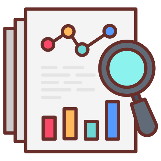
Reports
Reports are more traditional, offering a structured presentation of findings and insights, often accompanied by visualizations like charts and graphs.
Reports are ideal for in-depth analysis and detailed storytelling, providing a clear narrative with supporting evidence.
The best tool depends on the intended audience and the message we want to convey. Dashboards might be ideal for stakeholders who need ongoing monitoring, while reports might be better suited for in-depth analysis and decision-making.
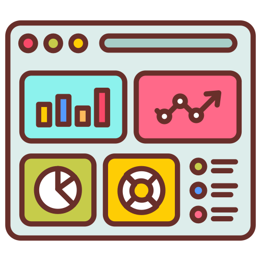
For our case study of Yukon Government Contracts, we designed an interactive dashboard using Power BI with key metrics, graphs, and slicers to better understand the data and inform our audience. As you can see, this dashboard can answer some of the questions raised in the last post.
Feel free to explore it, drag the slicers, and click the graphs to filter the data.
Dashboard
The information presented in this dashboard is provided only for illustrative purposes and data analysis exercises. While every effort has been made to ensure the accuracy of the data, it should not be considered definitive, exhaustive, or representative of reality.
This tool is used as an example of our company’s data analysis capabilities and should not be used for critical or formal decision-making. To obtain official data or make important decisions, please contact us, and our team of experts will generate an analysis suitable for you and your company’s needs.